
Ancient Geometry, Modern Pixels: Applying Shilpa Shastra to Procreate
- Chintan Varnangal

- Apr 2
- 2 min read
When we think of Shilpa Shastra, we often picture temple carvings or ancient bronze castings—arts that feel heavy, permanent, and deeply rooted in the physical. But at its core, this ancient Sanskrit science isn't about the material; it’s about Pramana (proportion), Varnalika (color), and Chitra (composition).
Today, as I open Procreate and pick up my Apple Pencil, I find that these 2,000-year-ol
d principles aren't just relevant—they are the ultimate guide to mastering digital art.
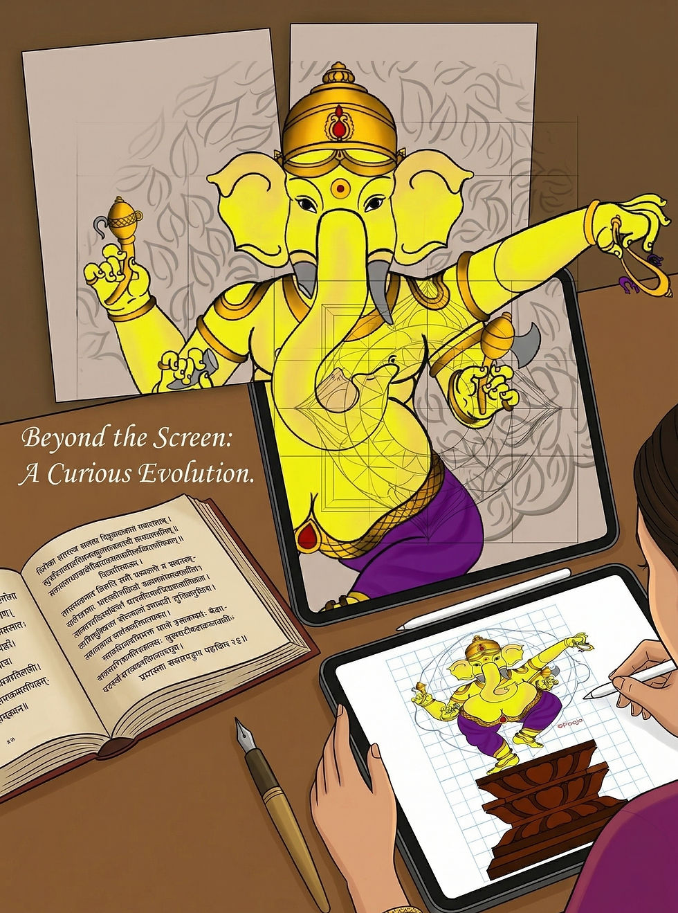
1. The Sutra in the Software: Proportions (Pramana)
In traditional Indian art, the Talamana system provides a rigorous framework for proportions, using a "Tala" (a unit of measure) to ensure harmony. In the physical world, this involved literal threads (Sutras) and measurements.
In Procreate, my Sutra is the 2D Grid and Drawing Guide. By setting up a custom grid, I’m essentially creating a digital Vastu Purusha Mandala for my canvas. Whether I’m drawing a modern portrait or a stylized figure, grounding the sketch in these geometric ratios ensures that the art feels "balanced" to the human eye, even before the first color is laid down.

2. The Power of the Stroke (Rekha)
Shilpa Shastra places immense importance on Rekha—the line. It is said that a master artist can convey life through a single, continuous stroke.
The digital transition often makes us feel like we have "infinite undos," which can lead to hesitance. I’ve found that by treating the Apple Pencil with the same reverence as a traditional Kalam (pen) or brush, I can achieve that same fluid vitality. Procreate’s Streamline and Stabilization settings act as a modern partner to the artist’s breath, helping to translate that ancient "flow" into a clean, digital vector.

3. The Alchemy of Color (Varnalika)
The ancient texts categorize colors not just by hue, but by temperament. There is a specific logic to how primary colors are mixed to evoke certain moods.
Digital art gives us a million-color palette, which can be overwhelming. By returning to the Shastric approach—limiting my palette to five or six core tones that represent specific elements—I find the work becomes more cohesive. Procreate’s Harmony tool and Color Palettes allow me to organize these "elemental" colors, ensuring the digital glow of the screen still carries the warmth of traditional pigments.

Beyond the Screen: A Curious Evolution
The "handmade" aspect of my work hasn't disappeared; it has simply evolved. Using Procreate isn't a shortcut; it's a way to iterate on these ancient rules faster than ever before. It allows for a level of precision that the Shilpis of old would have found intriguing.
We are all "Shilpis" (creators) in our own right. Whether we use a chisel or a stylus, we are still searching for that perfect balance between the rules of the Shastra and the spark of our own imagination.


Comments